Software runs my life

Tag: website Page 1 of 2

MasterChef – Generation Y Best Practice Marketing

MasterChef LogoMasterChef has been a huge surprise hit in Australia. The TV ratings have been sensational for Channel 10, with an average of 1.96 million viewers nationally (not bad from a total audience pool of just over 20 million). What keeps this average so high? The key, ironically, is the stickiness created by the side dishes. The MasterChef website gets an equally, if not more, astonishing 2 million views per week.

This website content is what keeps people engaged. Full show episodes stream very quickly from the site not long after screening, letting you catch up if you have missed an episode or just feed your addiction. Every recipe on the show is uploaded and available for those at home to have a crack, and beautiful images are cycled past the viewer. The taunt of “Can you master this MasterClass dish?” next to a picture of a beautiful coffee eclair is a great teaser to engage those at home.

The engaged community that has been built can be confirmed on Twitter. There doesn’t seem to actually be an official MasterChef twitter account, but that hasn’t stopped loyal fans creating unoffical ones and swamping Twitter with comments about how hungry they are, which recipes they love and who they want to get kicked off. The episode finished over an hour ago, but tweets are still coming in faster than one per minute. I really hope someone is monitoring this community really closely, what a great way to get feedback on the franchise directly from your customers.

Even if they are not monitoring the Twitter community, they will at least be monitoring their public forums. Yet another nod to the importance of communities in building a loyal following behind a brand. Over 30,000 posts proves that people are enjoying it, and breaking down the forums by participant gives a great selection criteria for the next season’s contestants (rumoured to be celebrities). Finally, they also have a Digg-like rating system on each recipe, so again the community can feel engaged and contribute back to itself.

How do you then cash in on this community? The product integration with Coles is subtle yet very effective. Recipes have a cost from Coles listed below them, for example this tasty soup is a mere $3.50 per serve. The PDF that you print to take to the shops of course has a Coles logo in the top right corner, as well as any notes about whether Coles stocks the item or not. They could have even taken this to the nth degree by having “MasterChef Prefilled Shopping Carts” from Coles Online, what armchair chef doesn’t want the ingredients delivered straight to their house? Even better, you could pre-empt the episode and deliver the Mystery Box challenge ingredients on the night of the Mystery Box episode! Now that would be challenging our engaged community.

The only thing that Channel 10 have done wrong, is screen Biggest Loser USA directly after MasterChef on a Sunday night. Then again, for some reason Biggest Loser makes me hungry too… 🙂

Xero Accounting usability review

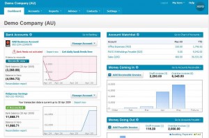
Xero touts itself as “The world’s easiest accounting system”. I don’t think they have much competition as far as usability goes in the accounting space, but I would guess that is because their competition probably think it is impossible to reduce accounting functionality into a usable package. I have had an extensive play with their demo, and I have seen a really surprisingly large number of unique and very usable elements to their user interface. Just when you think Web 2.0 usability techniques have plateaued, it is nice to be reminded that there are still plenty of boundaries to push. I just want to point out a few of my favourite interface elements of this beautifully designed interface.

The Xero Dashboard

The Xero Dashboard

When you first login you are greeted by a welcome message. This isn’t particularly unique, but it has nice touches. A warm dialog, pre-loaded sample data and a link to view the sample data straight away. They even have a different demo company set up for each country they operate in, taking into account local accounting rules etc. But that’s not all! Once you load the Demo Company data you can either take a tour, or tackle one of the top 10 tasks that people complete in Xero.

Tour or top 10 tasks

Getting Started Alert

I think this shows a good level of hand-holding, but also of understanding and targetting your customers.

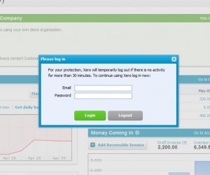
Another nice usability touch is the auto-logout function. Users generally hate the auto-logout 99% of the time, but it does save their bacon that final 1%. To make it as unbtrusive as possible Xero use a lightboxed login box when your 30 minutes is up (and it is good they actually display the limit here too). This makes logging back in a breeze, and teasing the user with all their content subtly appearing under the lightbox makes them feel that it isn’t a big process to dive back into the software again.

autologout is painless

Lightbox style Auto-Logout

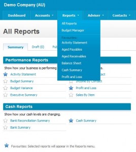
Reports are another area where usability is always difficult, in this case navigating to the reports that you use most regularly. Xero allows the user to simply click the star next to the report, and that report will then appear in the higher level Reports dropdown. You never have to see the full list of reports again!

Simple report navigation

Simple report navigation

It’s pretty minor, but it is a solution I never thought of to a problem I have faced for a while.

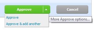
Finally one last idea that looks simple, but is actually very effective. The action button that performs more than one action:

button dropdown

Consolidated Action Buttons

I like this because it keeps action buttons to a minimum, allowing them to be placed more consistently and concisely on a screen. It also forces you to make sure the actions on a page are related and required.

Other nice elements include inline help content throughout, consistent positioning and colouring of action buttons, good usage of white space around tabs and tables, the ability to save drafts or ‘publish’ data entry and the use of simple language (“Money coming in” rather than “Accounts Receivable”).

Well done Xero, you are now my usability reference whenever I get stuck! 🙂

Integrating your CRM and Website

Closed for BusinessAs far as I am concerned, having a website without having a CRM/sales system behind it is like having a shopfront with no shop. People can view your products, but they can’t offload their hard earned cash. Why do that to yourself?

Unfortunately it seems that companies need to literally see people banging on the store door (via hits, emails, phone calls etc.) before they will open the store. How many customers have you missed in that time? You’re paying for the store location, so why not fit it out inside?

Salesforce announced at Dreamforce that they are taking this view to another level. Your website should be linked into the core of your company. Every process your company runs should be accessible (and deliver value) to the customer at all times. Zdnet give it good coverage, but I think Smoothspan explains it best. The basic premise is know your customers, and then deliver the best experience you can to them. CRM’s have always tried to get close, but it requires a company to be completely online and committed.

Page 1 of 2

Powered by WordPress & Theme by Anders Norén