Software runs my life

Tag: usability

Review: Getting Real by 37Signals

Getting Real CoverI was looking for good Product Management reading material, and was referred by a friend to the book “Getting Real” by 37Signals.

What did I like?

This book gets straight to the point, there is no bullshit whatsoever and it makes no apologies for that. Equally there is no room for bullshit in the product; decide a goal, keep the budgets tight, keep the team tighter, listen to the customer (at least when they bang down the door) and just execute the hell out of what you are doing.

This book is a reminder that building a product is not just about technically executing. Many usability, sales, HR and marketing issues must be addressed to deliver a successful, well-rounded product. You need to reflect this well-rounded nature too, everyone should take support calls, think of usability, write blog posts etc.

What didn’t I like?

There are however some minor things I don’t agree with. I think exit surveys are valuable, there should be a formal suggestion gathering and prioritisation process and there is a limit to how much information you should place online. If you have a mass appeal, generic app then I think these rules are a little different to someone developing a niche app for a specific market. Apart from these few items, I was nodding the whole way through the book.

Conclusion

This book embodies the entrepreneurial spirit of today’s web app developers. Put your heart into the app, and then put your app out for everyone to see. If you are a motivated person who wants to focus your vision and energy, then this book is for you.

Xero Accounting usability review

Xero touts itself as “The world’s easiest accounting system”. I don’t think they have much competition as far as usability goes in the accounting space, but I would guess that is because their competition probably think it is impossible to reduce accounting functionality into a usable package. I have had an extensive play with their demo, and I have seen a really surprisingly large number of unique and very usable elements to their user interface. Just when you think Web 2.0 usability techniques have plateaued, it is nice to be reminded that there are still plenty of boundaries to push. I just want to point out a few of my favourite interface elements of this beautifully designed interface.

The Xero Dashboard

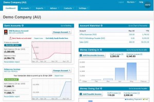
The Xero Dashboard

When you first login you are greeted by a welcome message. This isn’t particularly unique, but it has nice touches. A warm dialog, pre-loaded sample data and a link to view the sample data straight away. They even have a different demo company set up for each country they operate in, taking into account local accounting rules etc. But that’s not all! Once you load the Demo Company data you can either take a tour, or tackle one of the top 10 tasks that people complete in Xero.

Tour or top 10 tasks

Getting Started Alert

I think this shows a good level of hand-holding, but also of understanding and targetting your customers.

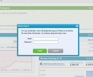
Another nice usability touch is the auto-logout function. Users generally hate the auto-logout 99% of the time, but it does save their bacon that final 1%. To make it as unbtrusive as possible Xero use a lightboxed login box when your 30 minutes is up (and it is good they actually display the limit here too). This makes logging back in a breeze, and teasing the user with all their content subtly appearing under the lightbox makes them feel that it isn’t a big process to dive back into the software again.

autologout is painless

Lightbox style Auto-Logout

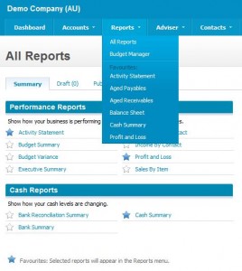
Reports are another area where usability is always difficult, in this case navigating to the reports that you use most regularly. Xero allows the user to simply click the star next to the report, and that report will then appear in the higher level Reports dropdown. You never have to see the full list of reports again!

Simple report navigation

Simple report navigation

It’s pretty minor, but it is a solution I never thought of to a problem I have faced for a while.

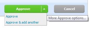
Finally one last idea that looks simple, but is actually very effective. The action button that performs more than one action:

button dropdown

Consolidated Action Buttons

I like this because it keeps action buttons to a minimum, allowing them to be placed more consistently and concisely on a screen. It also forces you to make sure the actions on a page are related and required.

Other nice elements include inline help content throughout, consistent positioning and colouring of action buttons, good usage of white space around tabs and tables, the ability to save drafts or ‘publish’ data entry and the use of simple language (“Money coming in” rather than “Accounts Receivable”).

Well done Xero, you are now my usability reference whenever I get stuck! 🙂

Domain.com.au Improves their Search Usability

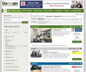
New Domain Search Form

Domain.com.au have updated their search tool by providing a new filtering method. It involves an accordion style menu on the left hand side that lets you select filters across a number of different property parameters. Filters include the usual bedrooms, price etc. plus some new fields such as Special Features, only those with a price specified, only those with photos, properties with Open Homes this weekend and more. There are some other more subtle changes, including different coloured summary view ad titles, a “See surrounding” link, floor plans links from the summary listing, sorting by inspection time and an RSS feed of search results.

I like the improvement, and it seems the agent feedback is generally positive too. They reference the DotHomes website as an example of great usability. I agree that is is very simple to use, however I do get frustrated by a lack of consistent controls and no ability to fine tune your options straight from the home page. For me, consistency is number 1 priority, largely because I think usability is about reducing the learning curve (and that is made much easier by only having one control to learn). Additionally when you refine that control the benefits flow across the whole site, enhancing every section. All the property websites still feel that a suburb search is all you need on the front page, I am hoping to see that change in the near future.

Best Usability Mockup Tools

In my current role I am really  noticing the huge rewards delivered through extensive prototyping and usability testing. The ability to better capture and illustrate user feedback (internally and externally) as well as accelerate application development cannot be undervalued. As they say a picture tells a thousand words, but in this case a functional picture replaces a thousand words in a requirements document with ease. Requirements documents still have their place, but not as a basis for user comment or even developer guidelines. So what programs do I recommend?

Balsamic screenshot

Balsamic screenshot

The first is Balsamiq, a great little tool that you can use to replace those back of the envelope sketches at 1am in the morning. It is very rough and intended for initial prototypes only, but I find this is well suited for situations where your stakeholders can’t see the concepts for the details. I like it because it lets me see if the ideas that click beautifully in my head actually translate to something workable in real life. Above all though it is quick. Don’t expect to do full working prototypes, but you can expect to have a full Web 2.0 application roughly laid out within an hour. Once you have the concept nailed down however then it is time to move on to some other tools. Think of it as throwing a couple of A4 sheets on a table and spending an hour scribbling, without the rubber shavings and sloping misshapen tables. It is great to be able to pin it to your wall to make sure you keep focusing on the key deliverables of the application, rather than getting carried away with the details of day to day execution.

Axure Screenshot

Axure Screenshot

My favourite tool however is Axure. This tool is great because like Balsamiq it lets you build a working website really quickly, but it then lets you “colour between the lines” and flesh out an almost fully functional prototype. Out of the box Axure is a great program, with all the basic web elements you would expect. They are all easy to edit, move, layout and link. Generating HTML prototypes is also extremely easy, a one click step once you have specified an output directory.

To really unlock the power of Axure however you need to use some community resources. This top 10 Axure resources link is a great starting point. A Clean Design’s templates (number 3 in the top 10) is my personal favourite, it has almost every Web 2.0 element you can think of. The ones that are missing (i.e. Accordian, flyout menus) are covered by the official Axure design library (which is also a good example of HTML generated in Axure).

In conclusion these two tools are the staples of my usability and prototyping work. They are so powerful that one starts wondering, how long until I no longer need to send these off to a coder to develop and deploy my solution?

Features vs Usability

Just one more feature...

Just one more feature...

Does adding features automatically mean reduced usability?

Some bloggers strongly disagree with this sentiment, for example arguing features only reduce usability when they are implemented poorly. I would definitely agree with some of his examples, including adding PNG support to browsers which did not affect end user usability.

Another that he gave was Google search, which is a perfect example of an interface that is simple to the nth degree. Clearly Microsoft didn’t learn anything when they tried to compete with it by adding 3 sliders to “tune” your search results. Instead Google addresses this need for additional tuning into it’s back end, which by many counts analyses and balances 10’s if not 100’s of contributing factors. There is a load or cost in adding features, however it can be paid either by your users in your software, or internally through process and/or business analysis. This is a balance however, and factors like scalability, audience and resources all have to be assessed before a solution can be scoped.

So how can you tell if you got this balance right? Usability can be tested independently with a sample pool of your audience, and this doubles as a great way to involve your customer and evangelise them. It does get expensive however, mainly due to the time and specialist software packages required (such as TechSmith Morae). A quicker and cheaper method is to just ask someone who knows, a usability expert.

There is a great article on usabilitynews.com comparing the two types of usability feedback. If it is your first attempt at usability testing (or it requires a full time resource to manage) than an expert is a great way to learn the process and common techniques. The bottom line however, is that there is no substitute for the horse’s mouth. Customer comments and videos provide concrete suggestions that will help to mitigate any external or internal stakeholder objections both pre and post deployment.

Top 5 CRM Selection Criteria

I have now been working with CRM systems for 5 years. It is only recently that I have seen the industry  (finally) mature to a stage where it is no longer engaged in a straight up feature war. This has been driven by two things; a maturity of product offerings and a recognition by customers that they should be making decisions based on an analysis of their own requirements, rather than a feature comparison matrix. To this end, here are my top 5 criteria for selecting a CRM system:

Usability – Without this, nothing else matters. If your users will not adopt and use your selection, it’s a waste of time and effort.

Alignment – What do you want to do with your CRM system? If you are looking to manage contacts & contact activity, you’d consider a completely different slate of products than you would if you were looking to customize a product to support your entire business process.

Product delivery – SaaS vs. client/server is a big consideration. Do you need an offline client, or is a plugin enough? If so, how robust does it need to be? This could direct you toward a client/server solution. Do you have an IT department and any in-house expertise? If not, could direct you toward a SaaS product.

Integration needs – While it is easier than ever to integrate SaaS products with other systems, some scenarios definitely call for an on-premise solution. This could be a limitation of your current software packages that you rely on but have no interface into.

Pricing – Do you have capital up-front? Do you want to buy your solution? If not, SaaS products are much easier to get started with. In some cases though, they can end up costing more in the long run. There is also a great price difference in different SaaS products and even within themselves based on functionality.

Australian Bank User Interfaces

I am really focusing on user interfaces at the moment, both due to requirements at work and personal interest. It is one of those areas where the computer science ends, and the people science begins. It is very rare to come across a good user interface, in fact UI’s have reached the stage of ridicule in many cases. One of the many defences IT people use is “my software is simply that complicated”. It needs the fields, options, checkboxes etc. otherwise you are losing functionality. I disagree, you just need to understand your customer better. Have you benchmarked and user tested? There are some good podcasts and consultants out there that hammer home the importance of user testing (and I don’t mean using UAT to check for bugs!).

Getting to my point, I was recently looking at changing banks. One of my biggest concerns (after interest rates) was the user interface and capabilities of the bank’s online banking system. These days banks provide a lot of functionality online, so it is very important to me that it I get a functional yet no-nonsense interface. Thankfully most banks provide some kind of test drive, but really this doesn’t provide a detailed enough coverage.

Australian Bank Comparison MatrixFortunately PC Authority magazine has done a user interface and basic functionality/security comparison for all the major Australian banks. I have included a copy of their comparison matrix to the left. The winner was the NAB, followed by the Bank of Queensland (who prove a top Internet offering is more about a quality rather than quantity spend). Some more informal user feedback would suggest that users actually care more about the interface than the security of their online banking. Phishing and viruses regularly make the quality of website security a moot point.

These days the internet banking site is often the sole point of interaction a customer will have for months at a time. Banks should be understanding this and really giving their user interfaces a higher priority. What is the cost comparison between customer care staff training and a decent usability review? I would argue that the usability review delivers a much better ROI.

Powered by WordPress & Theme by Anders Norén